
Practical WCAG checks
How to find and fix color contrast issues on a website
A color that looks readable on your monitor can still be difficult for someone else to see. Use measured contrast and real page context to guide the fix.
Start with the right threshold
WCAG’s minimum text-contrast criterion generally requires 4.5:1 for normal text and 3:1 for large text. Large text is at least 18 points, or 14 points when bold. Some exceptions apply, including logo text and inactive controls. Read the complete W3C criterion and exceptions.
Enhanced contrast is a different requirement. The extension can show findings at different conformance levels, so check the finding’s A, AA, AAA, or best-practice label before deciding what it means for your target.
Find the element and its actual background
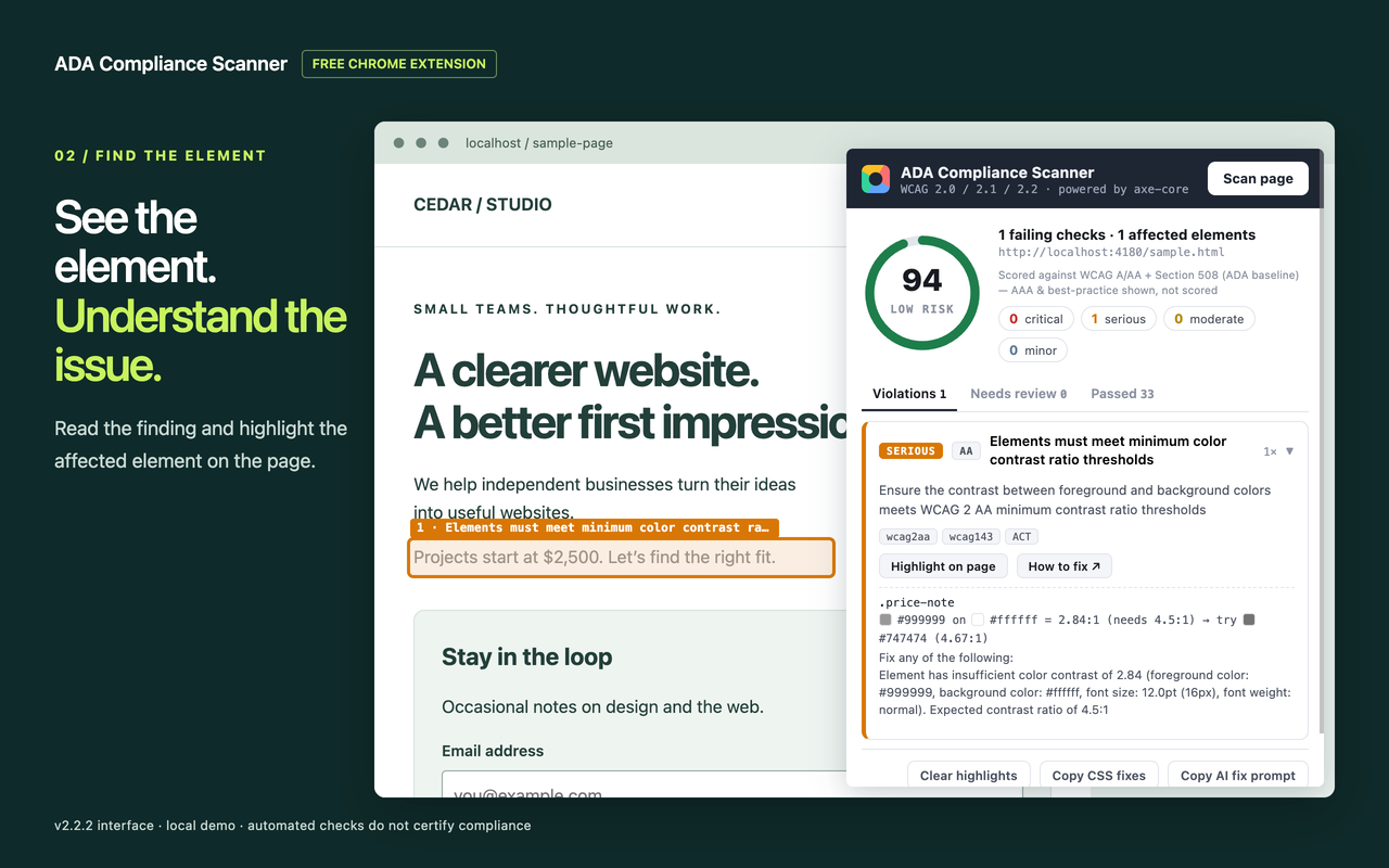
Open the page, choose Scan page, and review contrast findings. Expand an issue to inspect the affected element. Highlight it on the page and check the surrounding design.
Look for a shared cause: a muted-text token, a placeholder rule, or a button style that is reused across the site. Check whether transparency or a background image changes the effective color behind the text.
Change the source style
Here is a simple illustrative example on a white background. The original gray is approximately 2.85:1 against white. The revised gray is approximately 7.46:1.
/* Before: too faint for normal text on white */
.help-text {
  color: #999999;
  background-color: #ffffff;
}

/* After: darker text on the same background */
.help-text {
  color: #555555;
  background-color: #ffffff;
}
Those numbers apply to these exact opaque colors. Do not assume the same result over a photograph, gradient, transparent surface, or inherited background. If you use the extension’s Copy CSS fixes feature, review the suggested selectors and changes before applying them to your project.
Review uncertain results manually
Check Needs review as well as confirmed violations. Complex backgrounds and overlapping content may prevent an automatic measurement. Inspect the real foreground and background combinations; unresolved contrast is not a pass.
When text sits on an image, a solid text background or a well-chosen overlay may be easier to maintain than changing the text color alone. Verify the actual combinations produced by the design.
Rescan the component’s other states
Reload and run a fresh scan after the change. Check hover, focus, selected, and validation states where applicable. Also inspect other places that use the same color token, including dark backgrounds and alternate themes.
Record the original issue, the style you changed, and the states you checked. Then continue to the other findings. Solving contrast is one part of accessibility; it does not cover names, keyboard operation, focus order, or the meaning of the content.